
#19 Good: Starbucks
We know what you’re wondering: is Starbucks redesigning their logo? Nope, they did that back in 2011. When the coffee connoisseurs redesigned their logo, it didn’t ruffle any feathers. In fact, it didn’t seem to have any effect all. All they did was de-clutter the design by removing the green ring and name.

#18 Bad: American Airlines
Our favorite critique of this one is that it looks like a pair of 3-D glasses you get at the movies. Maybe it’s a sign of things to come. Perhaps they’re installing 3-D theaters in the planes now but they wanted it to be a surprise. If that’s the case, this is genius!

via http://netdna.webdesignerdepot.com/
#17 Good: Target
Target’s logo hasn’t really changed much in years. This is probably because if it’s not broken, why fix it? All they did was remove the name from the logo, leaving the simple target graphic intact. They made this move in 2011 around the time when other brands were simplifying their look. It worked.

via http://leagueofmediocregamers.files.wordpress.com/
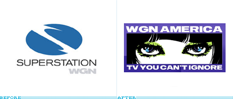
#16 Bad: WGN America
Chances are good that you've probably never noticed WGN’s logo before. Although they’re not really known for their original programming, they give you a pretty good line up of sitcoms. It’s certainly not “can’t ignore” TV but it’s still pretty good so when they updated their logo to this creepy set of eyes with the caption “TV You Can’t Ignore”, it was pretty off-putting.

via http://www.underconsideration.com/
#15 Good: UPS
It was probably a hard decision to make but UPS was very smart in their re-design. Realizing that their company has outgrown its roots, the redesigned logo makes it clear that the brand has evolved with the business. The new logo looks cleaner with an added silver background, but it keeps the brown and yellow colors with the lowercase lettering.

#14 Bad: Animal Planet
Just because the channel is kid friendly, doesn’t mean it has to look like a child designed the logo. The old design was great, it didn’t need any help. This one just looks cheap, unoriginal and what’s up with the sideways ‘M’?

#13 Good: Nike
When it came to a re-design, the company decided to just do it! Instead of trying to re-invent the wheel, they kept with the clasics. They simply removed the text from the logo and left the iconic symbol. It was a simple, smart move that other companies could learn from.

#12 Bad: Brooklyn Public Library
Here is a rule to live by if you’re ever in the library business: Your logo should be spelled correctly. Does anyone think that by leaving out letters, it’s going to make anyone want to come inside to read?

#11 Good: iTunes
The original iTunes logo featured a CD and a musical note. It was a great design, especially during a time when people were still converting all of their CDs to mp3's. Since the early 2000’s, the application is used more for digital purchases than anything else. The new logo is much more contemporary and respects the fact that CD's are now largely irrelevant.

#10 Bad: The Olympics (2012)
This will forever go down as the worst Olympics design in history. This was created by Wolff Olins for the 2012 London Olympics. In 2007 as the design debuted, it was met with harsh criticism. When it had been decided that this logo was going to be kept, people went crazy over it. It even made design critic Stephen Bayley call it "a puerile mess, an artistic flop and a commercial scandal". Snap!

#9 Good: T.G.I. Friday's
It feels like it’s almost too simple when compared to the first two logos but after considering it again, this logo is genius! Everyone is going to see it and instead of thinking “let’s go to Friday’s place”, they will think “let’s spend our Fridays here” Let’s see if this will be a profitable move for the 48-year-old company.

#8 Bad: eBay
Is eBay still stylized like eBay when it’s typed? Big B, little e? Who even knows anymore. It feels like both eBay and Yahoo! are in the same boring boat these days.

Source : http://likes.com/misc/20-logo-redesigns-the-good-the-ugly?page=13
0 Comments: